


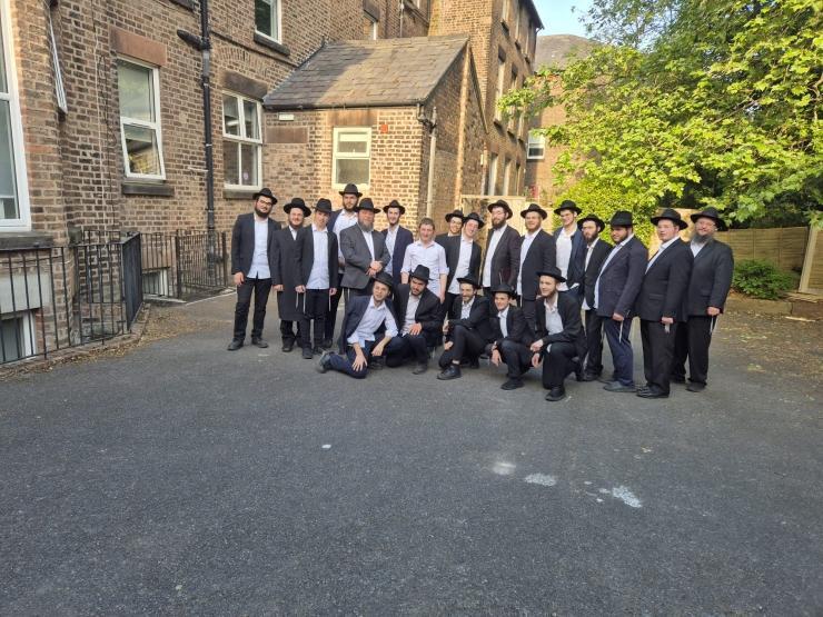
Like The New Look?

ChabadInfo.com, the premiere Chabad news site for Anash & Tmimim has revamped its look ● With a new editor, sections dedicated to Women, Torah Study, News, Videos & Much More, with content geared for Chabad Chassidim, ChabadInfo.com is set to become the new standard in Chabad ● Do you like it? Any feature you feel we should add? Hit the comments!
6061
Never Miss An Update
Join ChabadInfo's News Roundup and alerts for the HOTTEST Chabad news and updates!
Related Posts:


Most Popular


New Videos


Editor's Picks


Where are all the great videos that i used to show my kids??
Thanks for your feedback!
The all features like these, Coming soon.
nice fresh design! though difficult to read now that the articles are not centered
Thanks for your feedback!
What do you mean “not centered? All articles post on a wall
the articles ar on the side. i think people need to get used to it. alittle bit deficault.
Looks good, but this light gray font, which is so fashionable these days is idiotic and annoying. Old people have a hard time reading it and young people’s eyes are going to quickly become damaged straining to read it. Is there some kind of conspiracy by the so called graphics design community to make us all equal – so that young people become as visually impaired as old people ?
2 problems:
1) Search doesn’t work any more
2) When I find old CHabad.info articles online, the old links are redirected to the current news, instead of the old article.
Where are the niggunim
whenever I wanted kosher and uplifting videos for my kids we knew we could count on chabad.info for a great selection. I was able to say, ‘choose any video from here’, Can we have that back please, and a kids section with interesting chassidishe content please.
where are the niggunim?? I used to put it on for my kids to listen to.
Also, the term “Hot” news is not such a aidele word.
Thanks for your feedback!
The all features like these, Coming soon.
Before clicking on the article, I want to know if there are any comments and how many.
Like the layout, but where is MOSHIACH!!?
Very goishe look, took out Rebbe and Moshiach
Very not impressed
the old one was much better. more Chassidish more Moshiachdik etc. And I think everyone agrees. could you please put it back to normal? this makes it look more like COL or Shmais or something.
After looking at it for a week, I’ll tell you – old look was MUCH MUCH BETTER! It gave Chabad.info the unique look and character, with a Moshiach Flag, Rebbe’s picture, and a nice Yechi.
Simple and Aidel.
The new look is dull and goyish-looking.
Yechi HaMelech HaMoshiach!
very nice
Doesn’t work well for desktop or mobile. I understand this is supposed to be responsive but it was executed rather poorly. The desktop version is too wide and the mobile is very choppy and slow.